MULD
An identity for a compost bin made from used restaurant buckets. The product is anti-design, so the brand has to do the selling.
Topsoil. The dark, living layer that everything grows from. The whole identity is built on that one word.
- Context
- HTX Sukkertoppen · Technology A · 2023
- Role
- Visual identity
- Scope
- Logo · mark · colour · packaging · web
- Tools
- Photoshop · InDesign
The product is a used mayonnaise bucket. Nobody buys that for its looks.
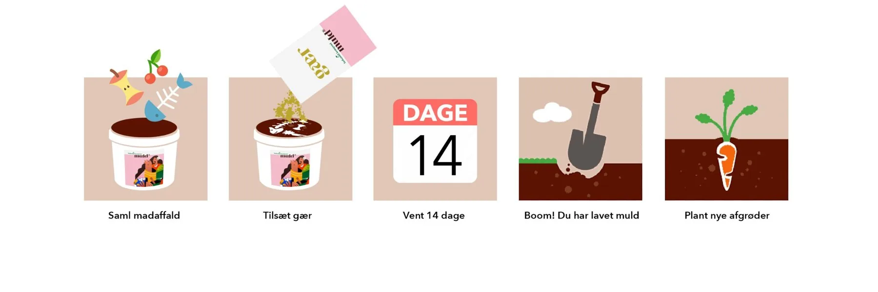
Bokashi turns food waste into soil in two weeks. Our bin was made from buckets restaurants throw away, and no two are the same. So I didn’t try to make the bucket beautiful. I made people want to be part of what it stands for.
The logo is stacked the way the ground is.
“muld” sits at the bottom, heavy and brown. It’s the soil, the foundation the rest stands on. “bokashi kompost” grows out of it in green, with a leaf on top. Behind it, the pink cuts the surface in two: above ground and below.
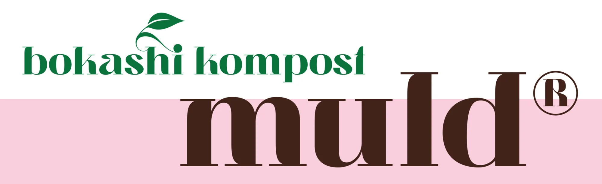
Muld. The company name, and the ground everything grows from.
Bokashi kompost. The product, and the plant that comes out of it.
The surface. It splits a page into above and below ground. Nobody else in the category uses it, and it speaks to the audience.
A dot, a stem, a leaf. The dot is the bucket. Growth comes out of it.
I drew one element and let it do several things. On its own, it’s decoration. Put an i under it and it marks information. Add an h and it says hi.



Bokashi kompost is the product. Muld is the company.
I kept them apart on purpose. Muld carries the ® and the brand. That way the company can launch other products later without starting over.
fra jord til bord
fra bord til jord
Every Dane knows “from farm to table”. It describes a circle but only goes halfway. Flipping it, “from table to soil”, closes the loop. It sounds familiar, so it sticks.
Women in the city who want to make a difference.
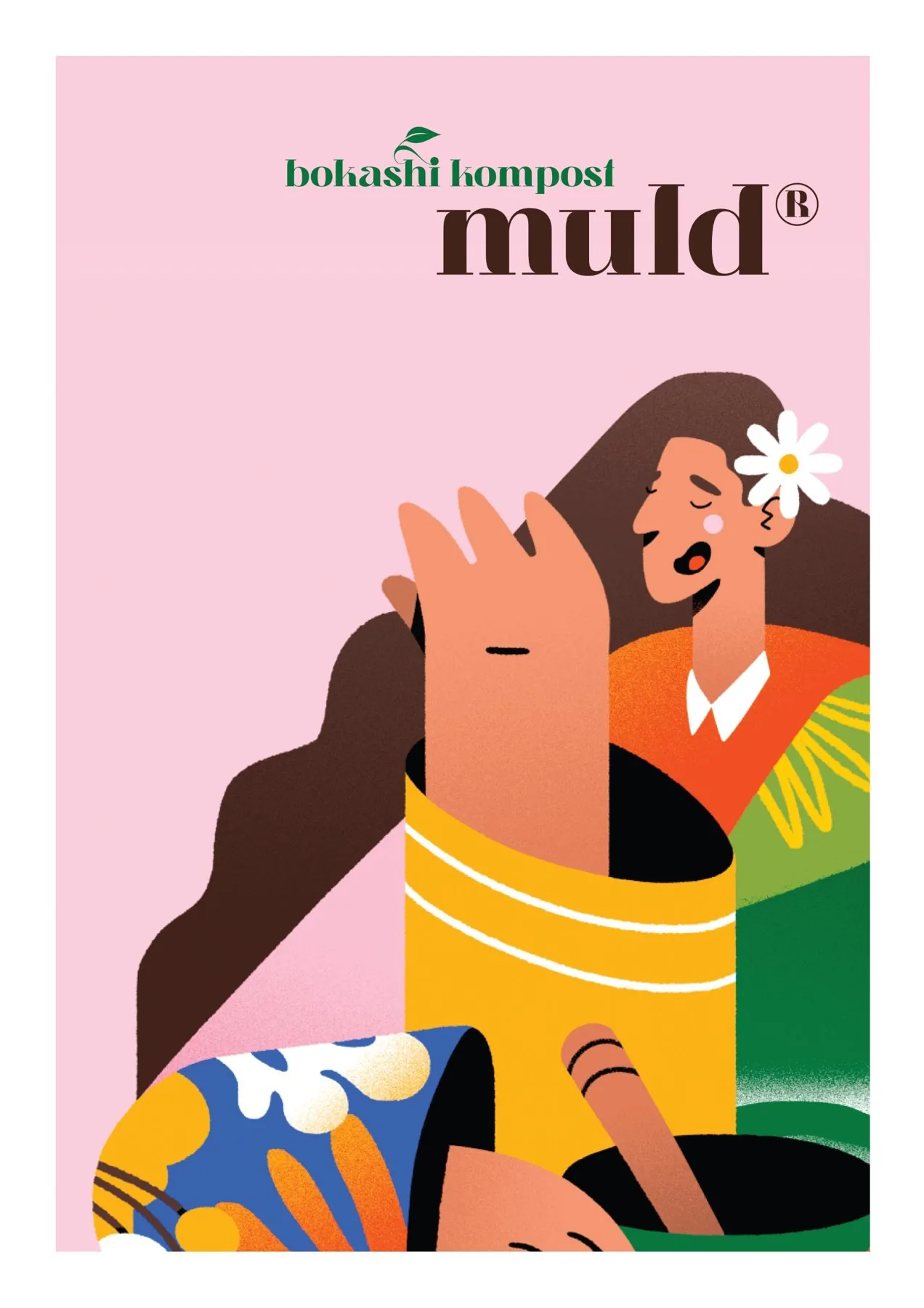
A small flat, a balcony full of plants, an opinion on climate. I chose an illustration that looks like her, and put her on the poster, the website and the bucket. She’s who the brand talks to.
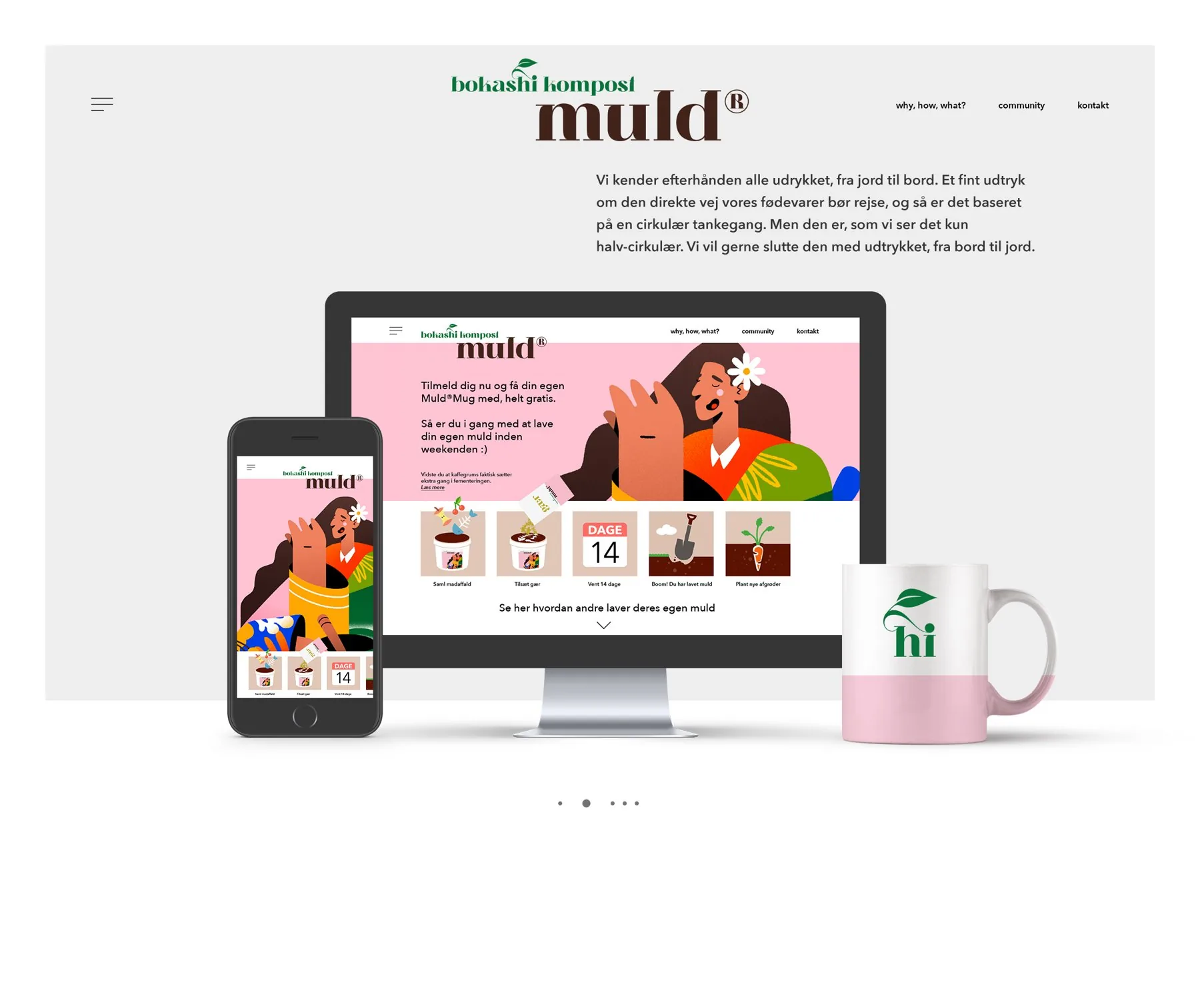
It had to work on a bucket that’s different every time.
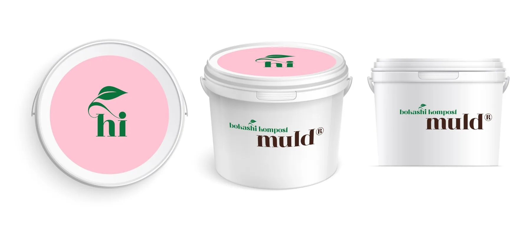
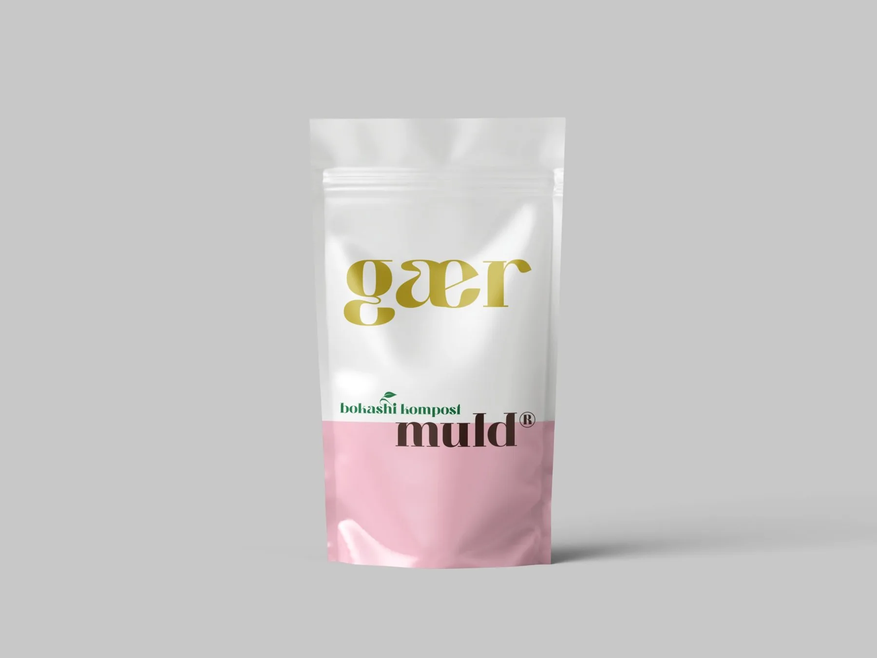
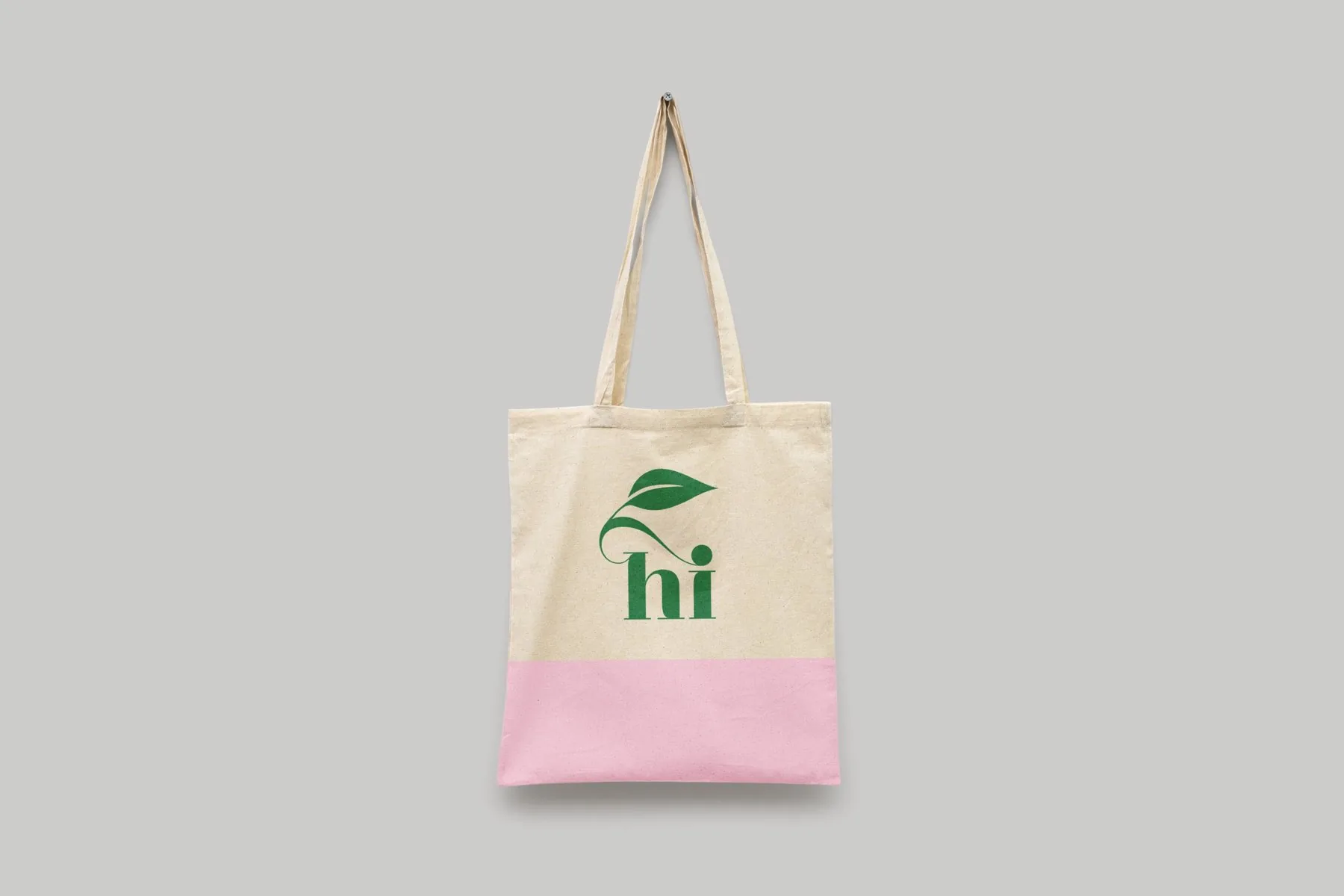
So nothing depends on the shape. A round sticker on the lid, the logo on the side. The same rules carry to the yeast pouch and the tote.
The whole process, without a manual. Collect, add yeast, wait, dig, plant.